A LinkedIn carousel is a PDF posted as a document, which people swipe through one page at a time in the feed. To make one, write one point per slide, design for a phone, export the slides as a single PDF and upload it with “Add a document” when you start a post.
Quick reference
Keep this table handy. The sections below explain each line.
| Item | What to do |
|---|---|
| Format | One PDF file, uploaded as a document post |
| Page size | Portrait, 1080 x 1350 pixels is a common choice |
| Slides | One idea split into three to eight points, plus a cover and an ending |
| Text per slide | A short title and two or three lines |
| Cover | The promise in a few words, readable at thumbnail size |
| Last slide | One call to action |
| Post text | A hook that matches the cover, who it’s for, a question |
| Tool | Free LinkedIn Carousel Generator, runs in your browser |
Planning: one idea, cut into pieces
Carousels fail at the planning stage far more often than at the design stage. The test is simple: can you say the whole carousel in one sentence? “Five onboarding mistakes that cost you customers” passes. “Everything about customer success” is a book, and nobody swipes through a book on their phone.
Good topics have a natural order. Frameworks, steps, checklists, before and after, a list of mistakes, lessons from a project. If you can number the parts, you have a carousel. For a longer list of angles, see LinkedIn Carousel Ideas.
Once you have the sentence, sketch the arc on paper before you open any design tool:
- Cover: the promise. “5 onboarding mistakes that cost you customers.”
- Point slides: one mistake each, with a short title and two lines of explanation.
- Summary: the whole idea in a line, for people who skipped ahead.
- Ending: one thing to do now. Save it, follow you or answer a question.
Write all the slide text first, in a plain document. Editing words is much faster when you aren’t also nudging boxes around.
The cover does most of the work
Everyone who scrolls past sees your cover. Only some of them see slide two. So give the cover more time than any other slide.
What a good cover has: a specific benefit in a few words, type large enough to read when the post is small on screen, and a clear match with the post text above it. What it doesn’t have: a paragraph, a tiny logo in the corner, a busy background photo, or a clever line that only makes sense after slide four.
The rules overlap a lot with writing a strong first line for a post. How to Write a LinkedIn Hook has patterns you can borrow for the cover headline.
Designing for a phone screen
Most people will read your carousel on a phone, held upright. That’s why portrait pages are popular: a 1080 x 1350 page fills more of the screen than a square or a wide slide.
A few habits keep slides readable:
- Large type and a short title on every slide.
- Two or three lines of body text. If a slide needs a paragraph, it’s two slides.
- One color theme and one font pairing for the whole file.
- A page number or a small swipe cue so readers know there’s more.
The one thing to avoid above all: exporting your meeting deck. Slides built for a projector in a conference room turn into gray smudges on a phone.
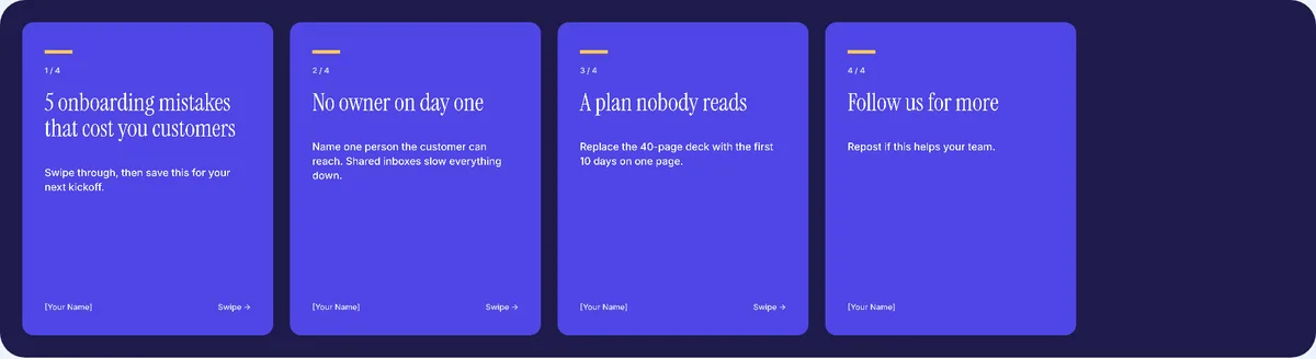
Building the PDF in our generator
We built the Carousel Generator so you can go from slide text to a finished PDF without a design app. You type a title and body for each slide, add your name, pick a color theme, move slides up or down, and download.
What we checked in the generator
We read through the generator’s code to confirm exactly what it produces, so you know what to expect:
- Every page is 1080 x 1350 pixels, portrait.
- You can have up to 10 slides. That cap is deliberate: if a topic needs more, it usually works better as two posts.
- A slide title can be up to 90 characters and the body up to 220. The title wraps to at most five lines and the body to at most eight, so very long text on a narrow line can get cut. Check the preview before you download.
- Each slide is drawn as an image and placed on its own PDF page. The text looks sharp, but it isn’t selectable in the PDF. Put anything people may want to copy, like a link, in the post text instead.
- Everything happens in your browser. Your slides aren’t uploaded to us.
When the download finishes, the tool reminds you of the next step: start a post on LinkedIn, choose “Add a document” and upload the file.
Uploading it to LinkedIn
- Start a new post and choose Add a document.
- Upload your PDF.
- Give the document a clear title. People can see it, so make it match the cover rather than “final_v3.”
- Write the post text above the document.
- Preview, then publish.
The post text is easy to rush. Treat it like a short post of its own: a first line that matches the cover, one or two lines on who it’s for, and a question at the end. If you want a bold first line or a neat list, the Text Formatter handles that. Our glossary page on document posts has more on how this post type behaves.
How many slides is right?
As many as the idea needs. A tight seven-slide carousel that people finish beats a fifteen-slide one where the middle repeats itself. If you notice two slides saying nearly the same thing, merge them. If you hit the generator’s 10-slide limit and still have more to say, split it into a series.
Five ways carousels fall flat
- The cover is clever but vague, so nobody knows why to swipe.
- Slides are crammed with text and readers have to zoom.
- Fonts and colors change partway through, which looks unfinished.
- There’s no ending, so readers reach the last slide and just leave.
- The post text says something different from the cover.
Make your first one
Pick a topic you can say in one sentence, write the slide text in plain words, then build the PDF in the free LinkedIn Carousel Generator and upload it as a document post. If you want your profile to match, the Banner Maker uses the same idea of one clear message per image. For how carousels fit into a wider posting plan, see the LinkedIn content strategy guide.