Formatting a LinkedIn post comes down to four habits: paragraphs of one to three lines, an empty line between ideas, a plain list when you have steps or tips, and bold on one line at most. Everything has to fit inside the 3,000 character limit. LinkedIn gives you no formatting toolbar, so bold and italic are really Unicode characters; the free LinkedIn Text Formatter inserts them and shows a live preview.
That is the theory. It is easier to see in practice, so most of this page is one draft, fixed five times.
What you have to work with
A post is plain text. Within that, you get:
- Line breaks and empty lines, which do most of the work
- List markers you type yourself, like •, → or “1.”
- Unicode bold and italic letters, which look styled and survive copy and paste
- Emoji, best used as markers rather than decoration
- @mentions and #hashtags
There is no Markdown, no headings and no inline links, only pasted URLs. If you came from a blog editor, that feels limiting. On a phone screen it is plenty.
The draft we will fix
Here is a typical first draft. The idea is decent. The shape is not.
#customersuccess #onboarding #saas Last year I lost my biggest customer and it really made me rethink how we do onboarding because looking back the problems started in the first week, we never mapped out the first ten days, nobody on our side owned the account, and we never celebrated the first win with them so they never really felt progress. I think the best churn fix starts before the contract is even signed.
Seventy-odd words, one block, hashtags first. Here it is, one fix at a time.
Fix 1: break the wall into short paragraphs
Before: the whole thing is a single paragraph.
After:
Last year I lost my biggest customer.
Looking back, the problems started in the first week.
We never mapped the first ten days. Nobody on our side owned the account. And we never celebrated their first win.
Same words, nearly. The difference is that a reader on a phone can see where each thought ends. Dense blocks look like homework, and people scroll past homework even when the content is good. One to three lines per paragraph is a comfortable range; you do not need a rule stricter than that.
When you draft in a notes app or a doc and paste into LinkedIn, check that the empty lines came along. The Post Preview shows your line breaks the way the feed will.
Fix 2: move the hook up and the hashtags down
Before: the first thing anyone sees is #customersuccess #onboarding #saas.
After:
Last year I lost my biggest customer.
(body)
#customersuccess #onboarding
The feed shows only the first couple of lines before the “see more” cut, which we explain in the glossary entry on the see more fold. Spending those lines on hashtags wastes the only part of the post everyone reads. Put the hook first and the tags at the very end, or drop them.
For help with that opening line itself, see how to write a LinkedIn hook.
Fix 3: turn the run-on list into an actual list
Before: “we never mapped out the first ten days, nobody on our side owned the account, and we never celebrated the first win.”
After:
What I’d do differently:
• Map the first 10 days • Name one owner • Celebrate the first win
Three parallel items hiding in a sentence are begging to be a list. A simple dot (•) is the cleanest marker. Arrows (→) suit steps, check marks suit wins. Numbers suit anything where order matters.
You can type the markers, or select the lines in the Text Formatter and click the bullet or numbered list button. Three to five items is about what people remember; past seven, think about splitting the post.
Fix 4: bold one line, not five
A common overcorrection after Fix 1 is to bold every short line. Then nothing stands out.
Before:
𝗟𝗮𝘀𝘁 𝘆𝗲𝗮𝗿 𝗜 𝗹𝗼𝘀𝘁 𝗺𝘆 𝗯𝗶𝗴𝗴𝗲𝘀𝘁 𝗰𝘂𝘀𝘁𝗼𝗺𝗲𝗿.
𝗟𝗼𝗼𝗸𝗶𝗻𝗴 𝗯𝗮𝗰𝗸, 𝘁𝗵𝗲 𝗽𝗿𝗼𝗯𝗹𝗲𝗺𝘀 𝘀𝘁𝗮𝗿𝘁𝗲𝗱 𝗶𝗻 𝘁𝗵𝗲 𝗳𝗶𝗿𝘀𝘁 𝘄𝗲𝗲𝗸.
𝗪𝗵𝗮𝘁 𝗜’𝗱 𝗱𝗼 𝗱𝗶𝗳𝗳𝗲𝗿𝗲𝗻𝘁𝗹𝘆:
After:
𝗟𝗮𝘀𝘁 𝘆𝗲𝗮𝗿 𝗜 𝗹𝗼𝘀𝘁 𝗺𝘆 𝗯𝗶𝗴𝗴𝗲𝘀𝘁 𝗰𝘂𝘀𝘁𝗼𝗺𝗲𝗿.
Looking back, the problems started in the first week.
What I’d do differently:
Pick the hook or the single key line, and bold that. Keep names, job titles, skills and hashtags in plain letters. Styled Unicode letters are different characters from normal ones, so search and screen readers may not treat them as the word you meant. How to bold text on LinkedIn goes into that trade-off, and the Bold Text Generator lets you compare styles side by side.
Fix 5: give it an ending
Before: the post stops at “starts before the contract is even signed.” That is a fine thought, but there is no signal that the post is done, and no invitation to reply.
After:
The best churn fix starts before the contract is signed.
What would you add to that list?
A one-line takeaway followed by a real question (one you would like answered, not “Agree?”) closes the loop. It also gives commenters an easy place to start.
The finished post
Put the five fixes together and you get this:
𝗟𝗮𝘀𝘁 𝘆𝗲𝗮𝗿 𝗜 𝗹𝗼𝘀𝘁 𝗺𝘆 𝗯𝗶𝗴𝗴𝗲𝘀𝘁 𝗰𝘂𝘀𝘁𝗼𝗺𝗲𝗿.
Looking back, the problems started in the first week.
What I’d do differently:
• Map the first 10 days • Name one owner • Celebrate the first win
The best churn fix starts before the contract is signed.
What would you add to that list?
#customersuccess #onboarding
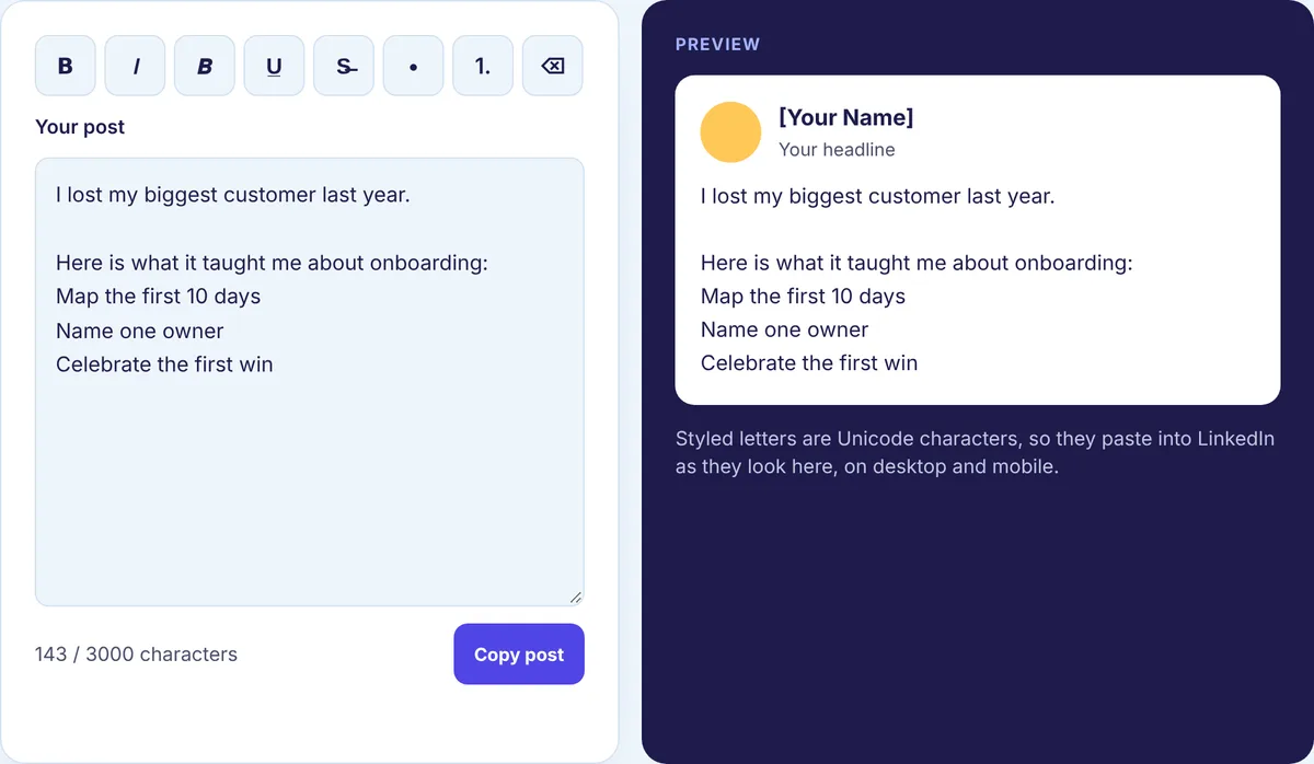
Underneath, that is a reusable shape: hook, empty line, one to three lines of context, the body as short paragraphs or a list, a takeaway, then a question or next step. It fits stories, how-tos and opinions alike.
What we checked in our own tools
Unicode styling has a few quirks that are easy to miss, so we ran some text through the same code our Text Formatter uses and looked at the output. Here is what came back.
- The hook “I lost my biggest customer last year.” is 37 characters plain. Bolded in the sans bold style, our Character Counter still counts 37, because it counts one per Unicode character. Under the hood, each bold letter takes two units in the UTF-16 encoding many programs use, so a tool counting those units would report 67 for the same line. If two counters disagree about a bold post, that is usually why.
- Underlining works differently. It adds a combining mark after every character, so the same 37-character line came back as 68 characters. Underline eats into your limit fast.
- Converting styled text back to plain gave us the original sentence exactly, so bold you regret is easy to undo with the Clear button.
- The sans italic style has no digits in Unicode. “Q3 2026” in italic kept its numbers plain. Sans bold does have digits, so they turned bold.
- Selecting three lines and choosing numbered list prefixed them 1., 2. and 3. Choosing it again removed the numbers, so the button works as a toggle.
- An emoji with a skin tone, like a thumbs up, showed as one symbol but counted as two characters.
None of this changes how you write. It does explain why a post that looks like 2,950 characters can behave differently from one that is plain text.
How long should the post be?
Up to 3,000 characters, but let the idea set the length. A single sharp point can land in four lines. A story or a set of steps can run longer if every paragraph pulls its weight. Watch your count in the Character Counter as you edit; it also shows words and reading time.
A short list of habits to drop
- Putting every sentence on its own line for the entire post. A little air helps; a column of single lines is tiring.
- Emoji in the middle of sentences, or more than one per section.
- Bold on more than one or two lines.
- Hashtags anywhere near the top.
- Ending without a takeaway or a question.
Before you publish
Paste your draft into the free LinkedIn Text Formatter, add bold to one line and turn any hidden lists into real ones. Then run it through the Post Preview to see the fold. For what to post in the first place, our LinkedIn content strategy guides cover planning, ideas and timing.